Tarsem:
Assisting a Visionary
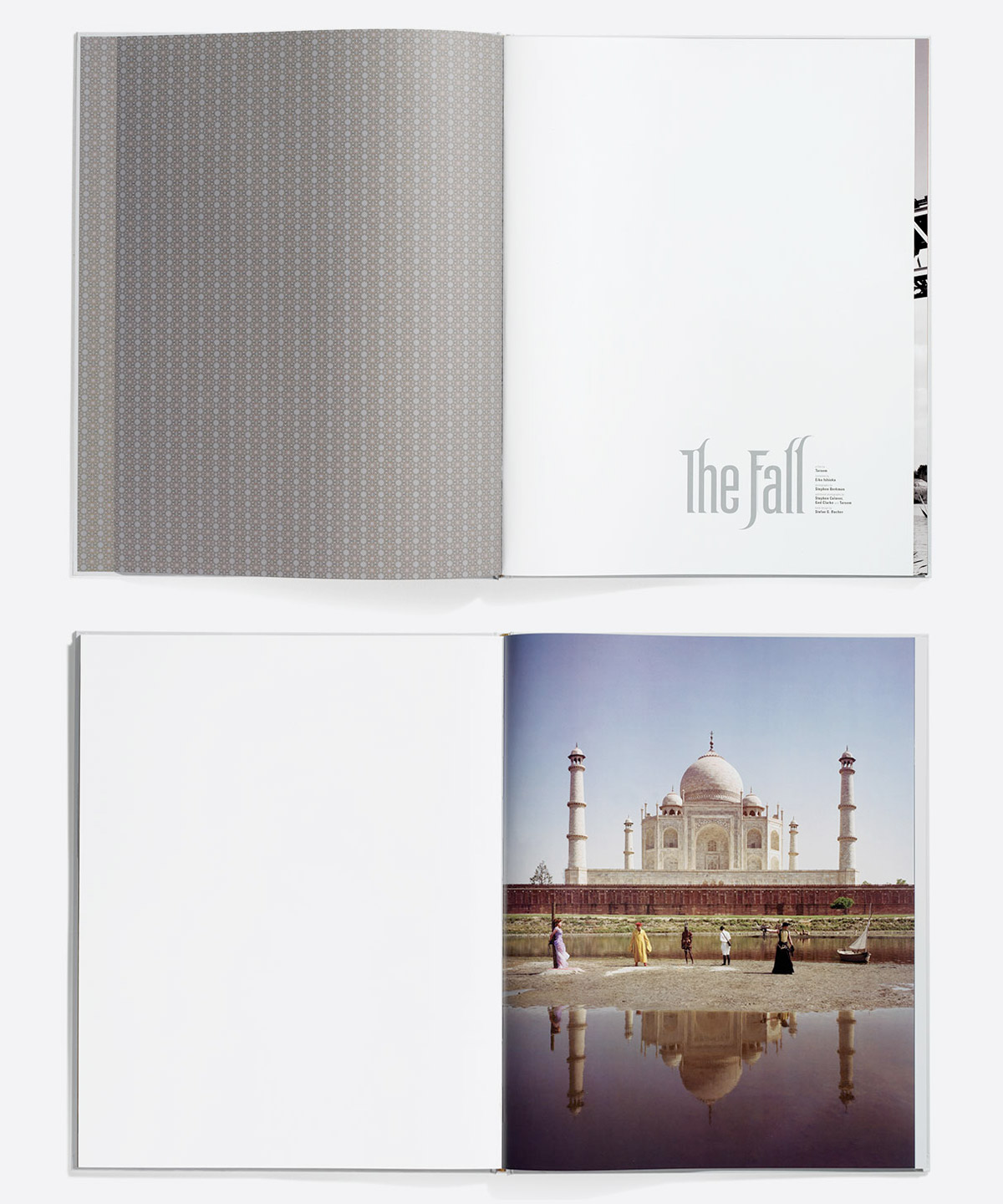
Visionary director Tarsem Singh first approached us while working on his landmark movie The Fall. He had self-financed this incredible fantasy film, and now needed to find a distributor. The only problem? He was still fine-tuning the edit, and didn’t want to show anything other than the final cut. He needed something that would show the magical images and epic scope of the film... without showing any of the actual film.
Selling a Film You Can’t See
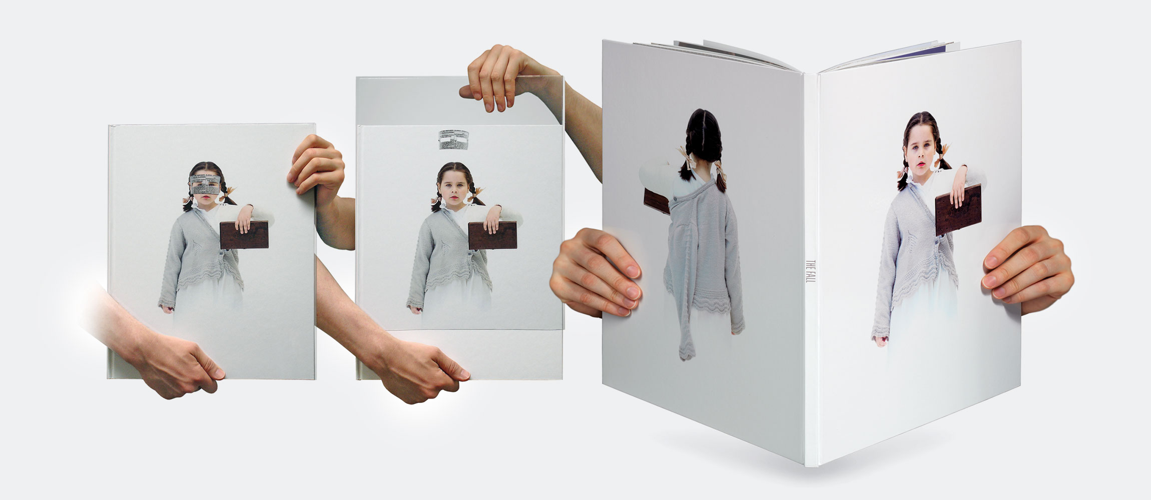
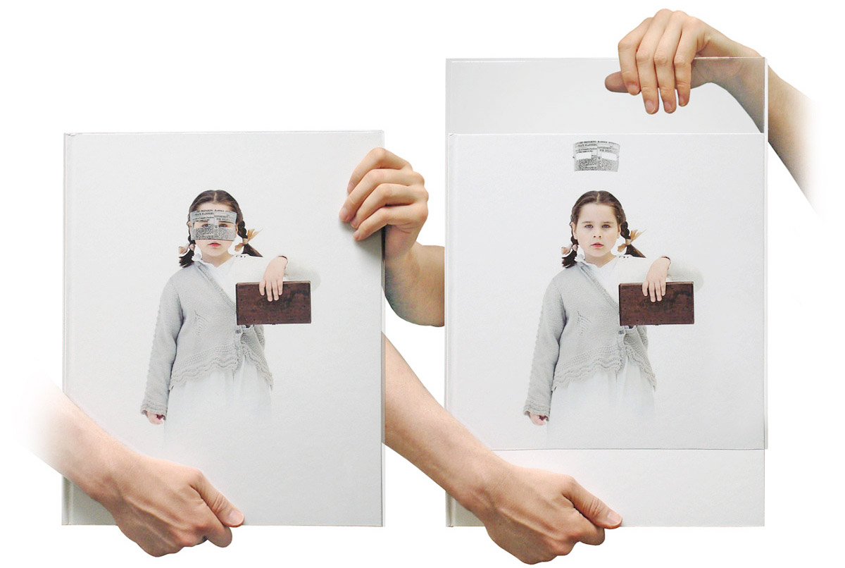
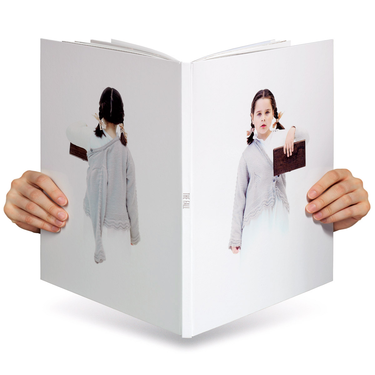
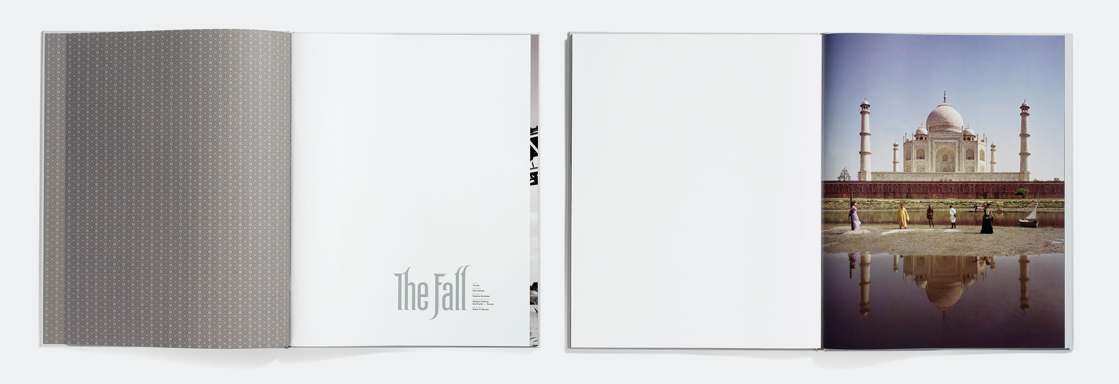
Tarsem entrusted us with over 7,000 still images taken on set by renowned photographer Stephen Berkman (and a few from the studio of his Oscar-winning costume designer Eiko Ishioka) with the mandate of creating an object to entrance movie distributors. The result was an 80-page hardcover book almost as epically scaled as the film at 14×17 inches and protected by a custom plastic sheath that put the iconic paper mask on Alexandria, the hero of the film. 344 produced the entire book from conception to printing, on time and on budget.
Bringing High End Typography to The Big Screen
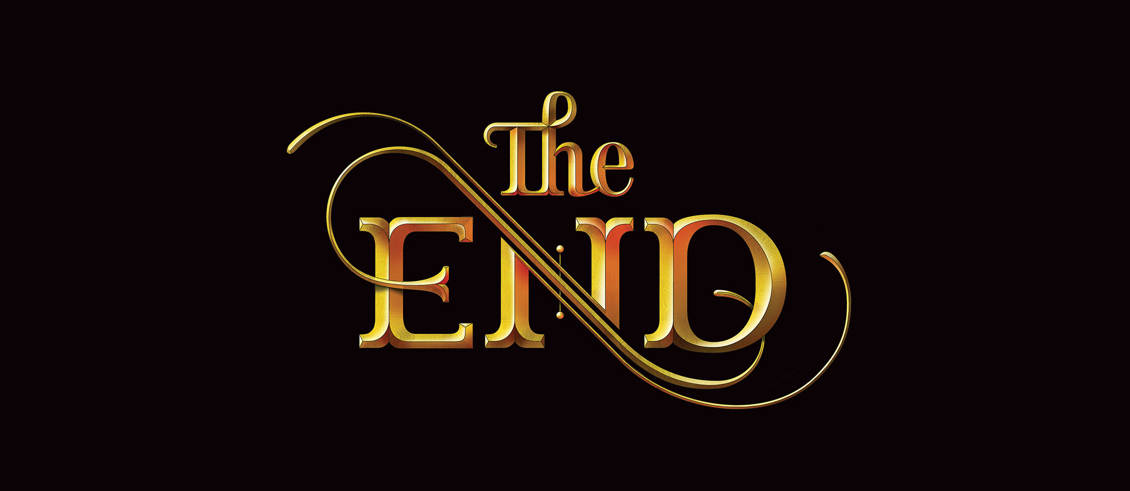
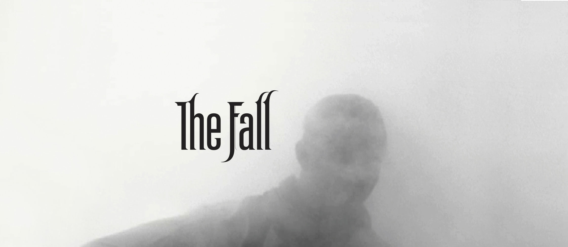
Our work on the book led Tarsem to award us the job of creating the typography for the film itself. We custom-made the film’s title, and produced the end credits, as well as several bits of incidental type for the film. 344 also provided typography for several TV spots featuring a rave review by film critic Roger Ebert.
Film titles are in some ways the poetic distillation of branding. It falls to the titles to set the mood for the film to come, and to create an audio-visual environment that makes the viewer feel at ease. The design needs to say, “You are about to see something that was made with care. You are in good hands.” As with poor lighting or a sloppy audio mix, viewers may not be able to put their finger on what’s wrong, but they can feel it. Done properly, design stacks the deck in your favor.
Creating a Lasting Partnership
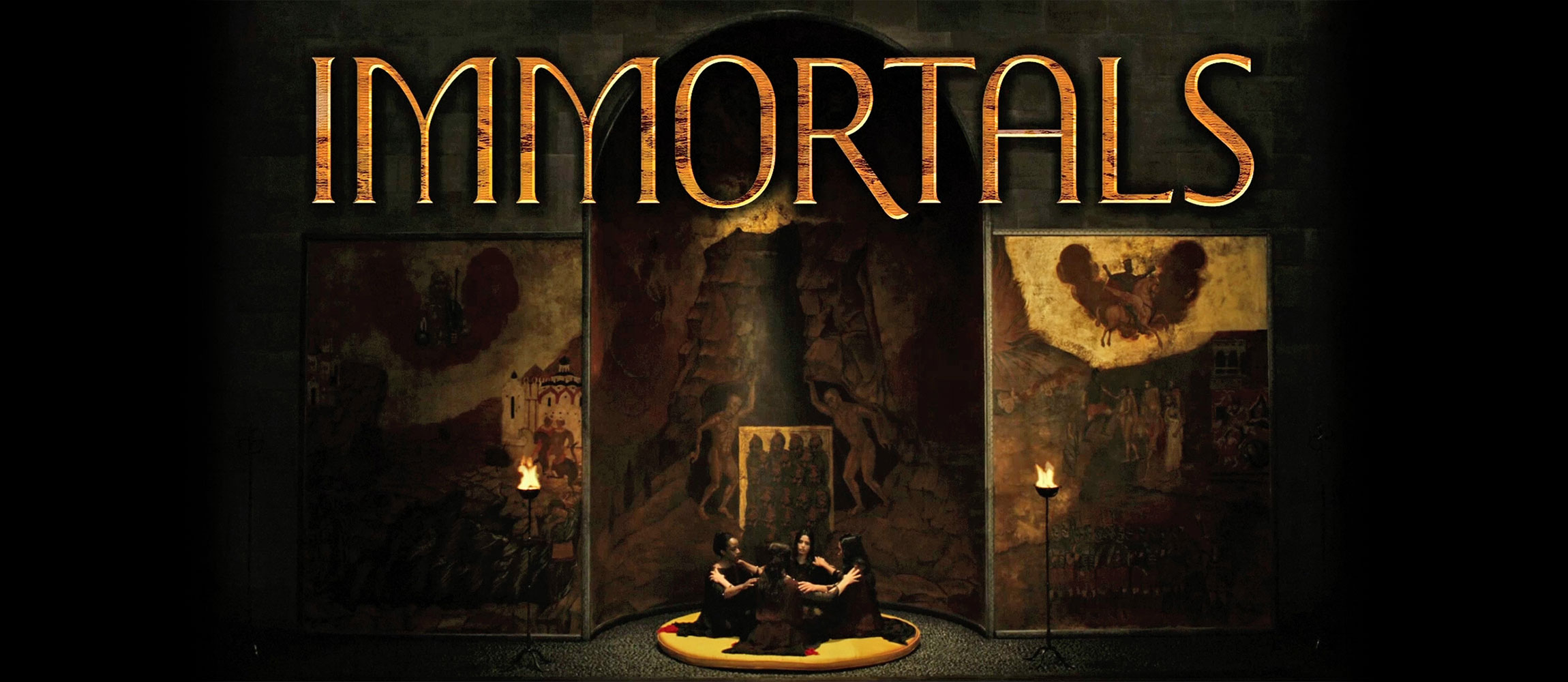
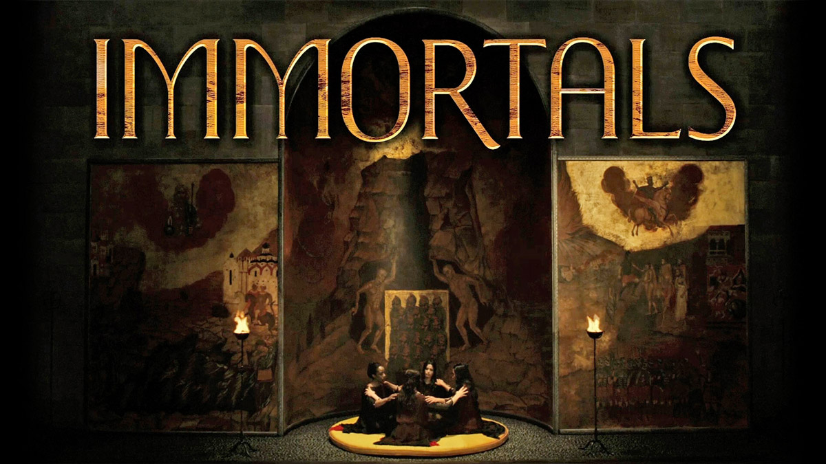
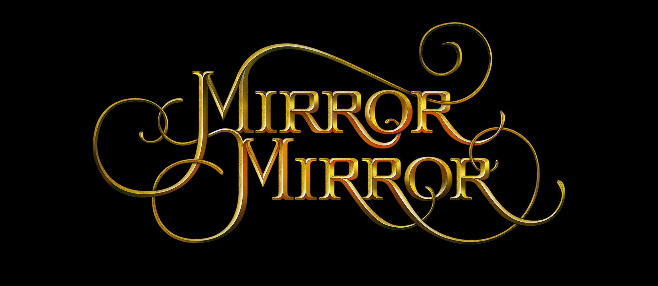
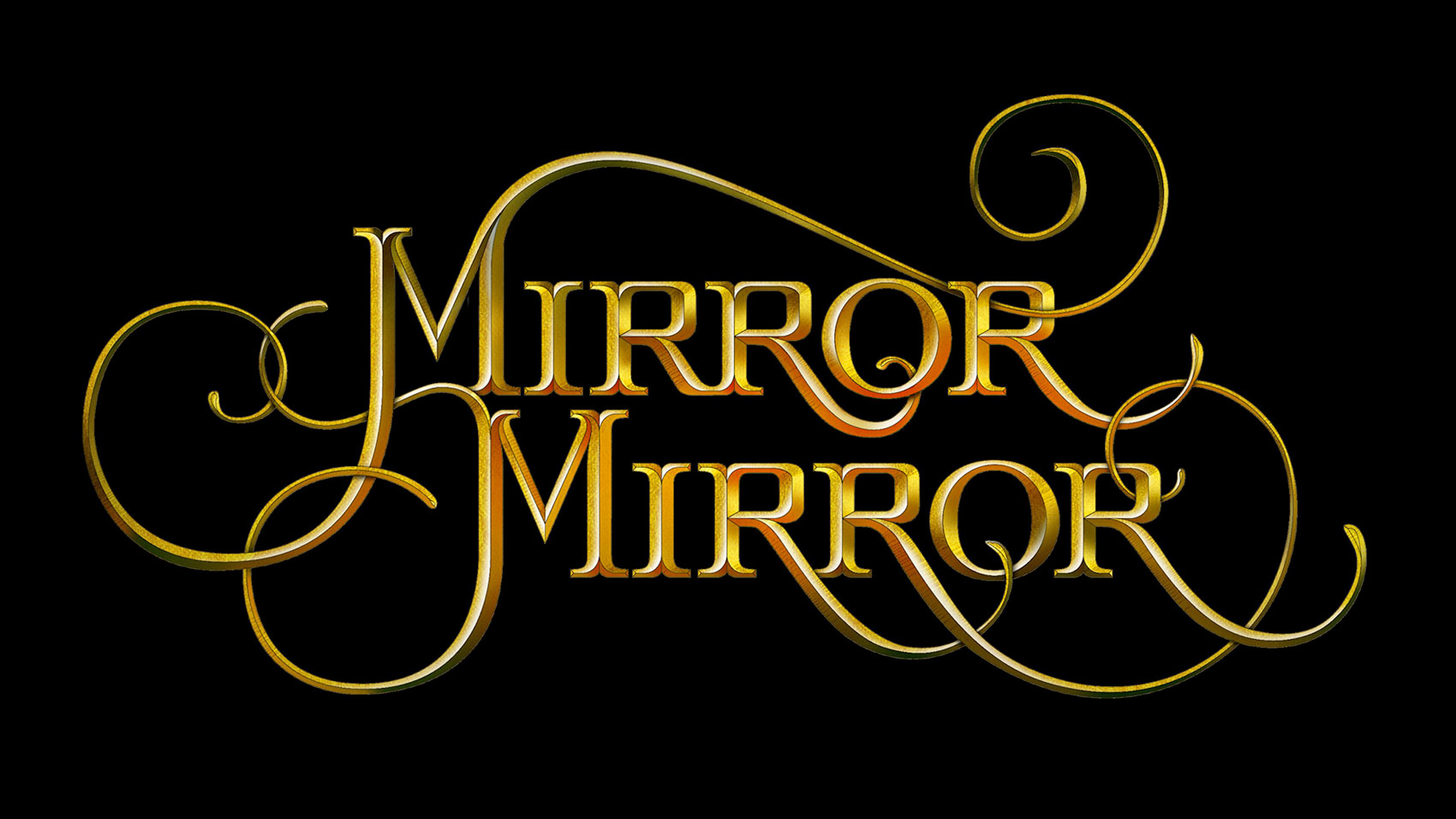
Following our collaboration on The Fall Tarsem returned to 344 for the typography on his next two features, Immortals and Mirror Mirror. For both films, we created custom main title lettering along with subtitles, location cards, and main end credits.
What’s next?
Most recently, Tarsem invited us to design the logo for his production company Oedipus Pictures. Working with Tarsem is always an honor and a pleasure. We are proud of our long and fruitful partnership, and we’re always delighted when he has a new challenge for us.